Certificate in UI Design course: Research
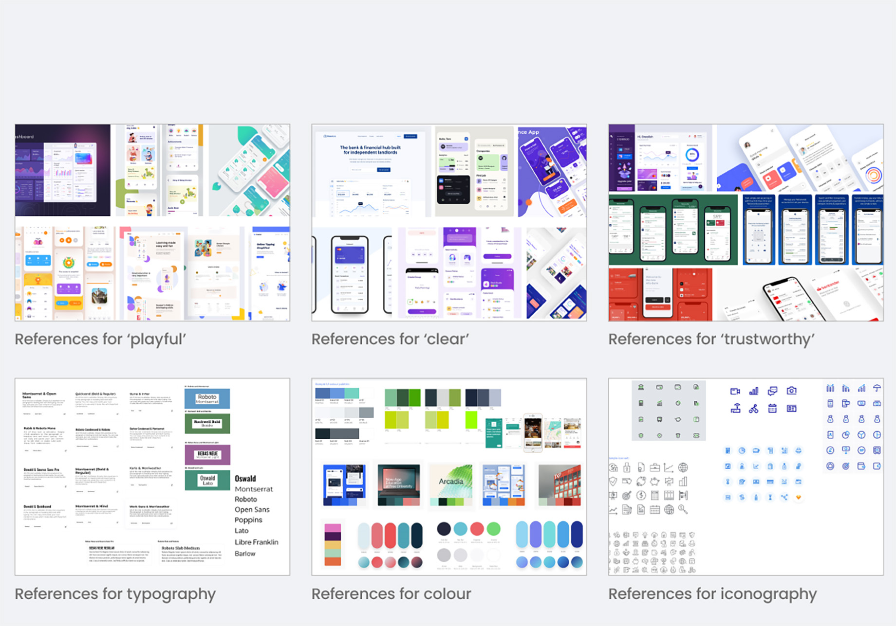
I began with moodboards of examples for the keywords in my brief; ‘playful’, ‘clear’ and ‘trustworthy’. My research consisted of mood boarding, typography, competitor analysis, grids, responsive designs, iconography, colour, accessibility.
Certificate in UI Design course: My designs
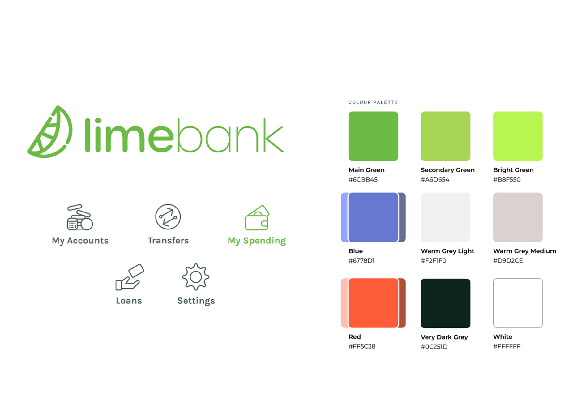
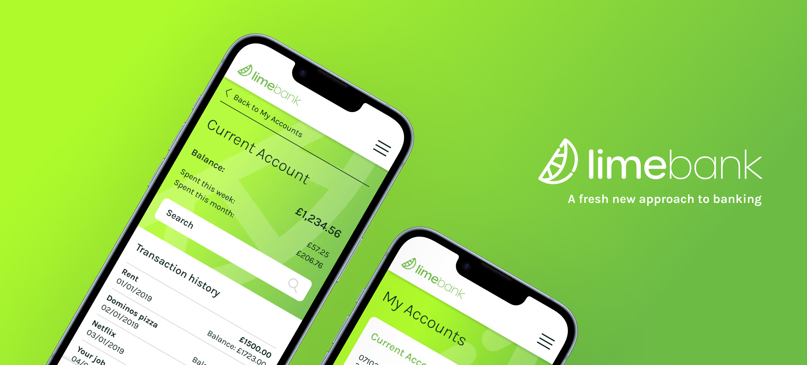
After I researched colour theory, I choose the colour green because green can represent new beginnings and growth. Although a logo design was not part of the project, I was looking at words ‘fresh’ and ‘new’ in relation to banking and arrived at ‘fresh’ + ‘lime’ so I decided to name my imaginary bank ‘Limebank’. I quickly created a logo using a sans-serif font and added a ‘wedge’ icon.
Certificate in UI Design course: My designs
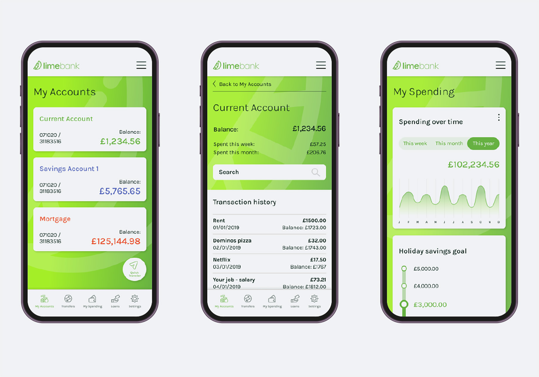
I was given basic wireframes and went through several iterations to arrive at these designs. I did consider having just the icons on the navigation buttons but seeing as some icons could be ambigious, especially for new users, I included the descriptive text.
Certificate in UI Design course: My designs
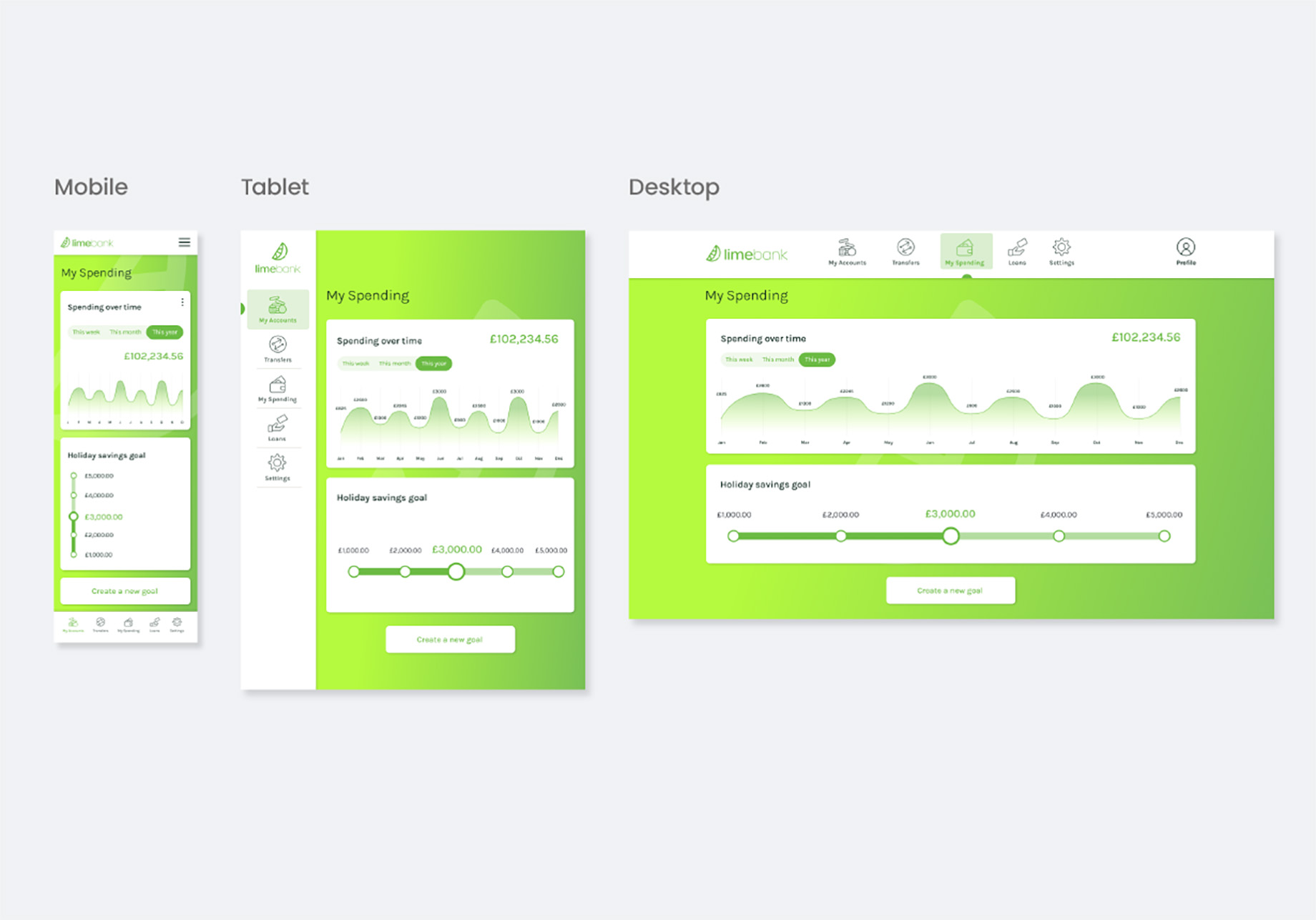
I experimented with different responsive grids and arrived at these solutions.
Certificate in UI Design course: Conclusion
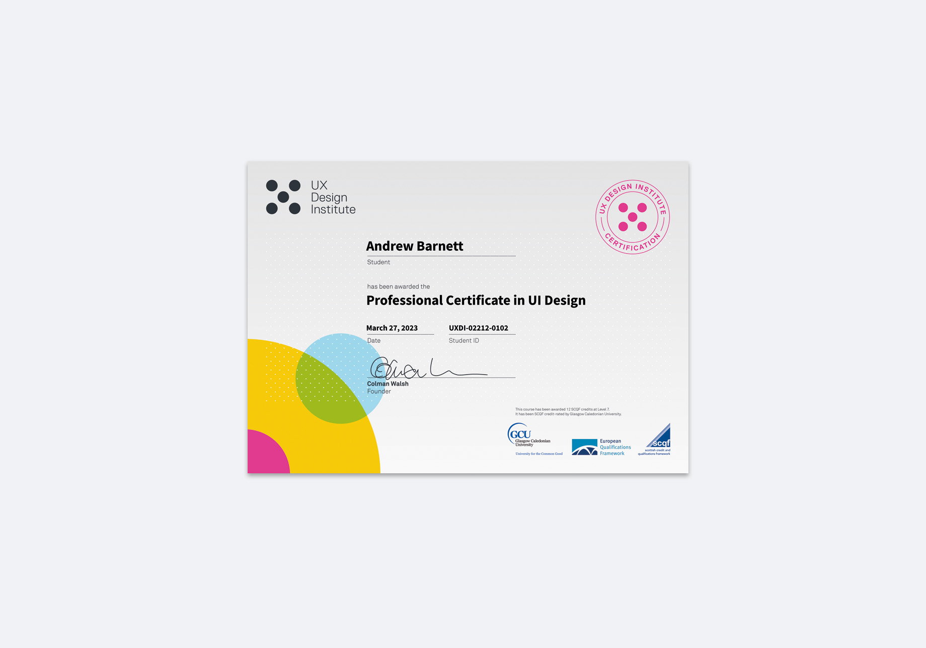
Overall, I was really pleased with my designs. I think the icons and buttons are the right size for each screen. I like the clear, bright and simple look as it looks modern and easy to use. I am happy with my colour palette and my chosen typeface. I’m pleased with my certificate in UI design and I was glad to gain more experience working in Figma.