Avia Park Mall Touchscreen
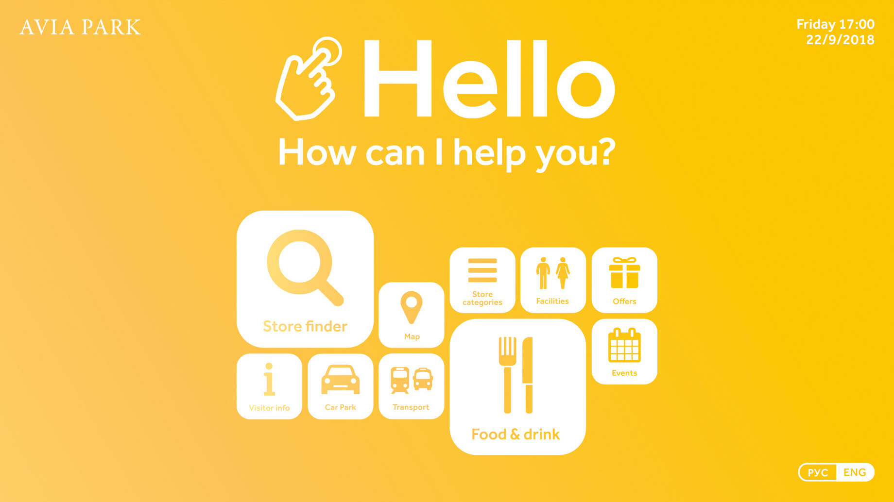
This image shows the home screen at rest. It is used as a base to launch new enquiries and is accessible from all the other pages by the home button at the bottom. The user has the ability to change language between Russian and English on the bottom right on any screen.
Avia Park: Home screen
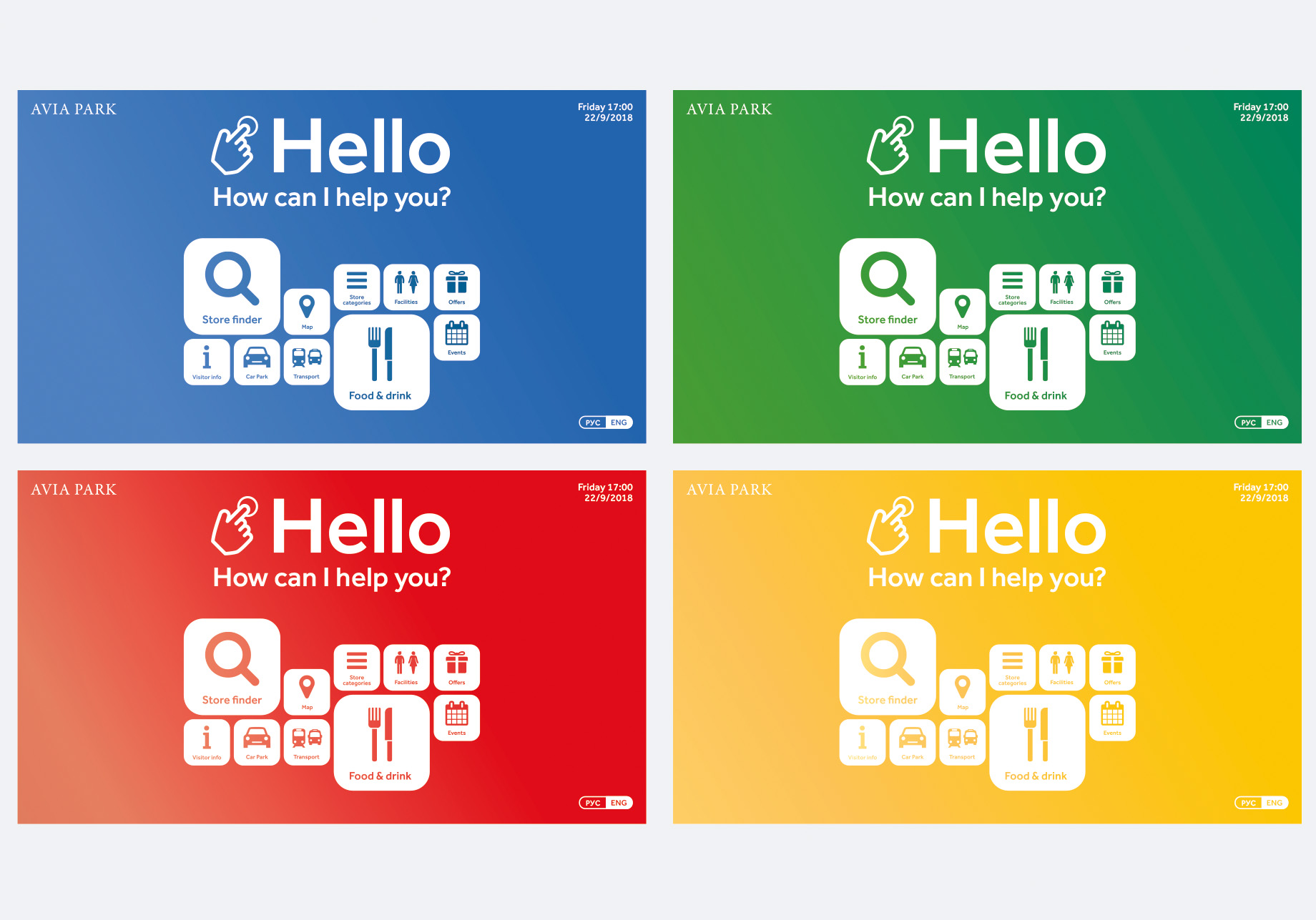
The colour theme differs depending on what zone of the mall the user is in, in relation to the car park.
Avia Park: Content map
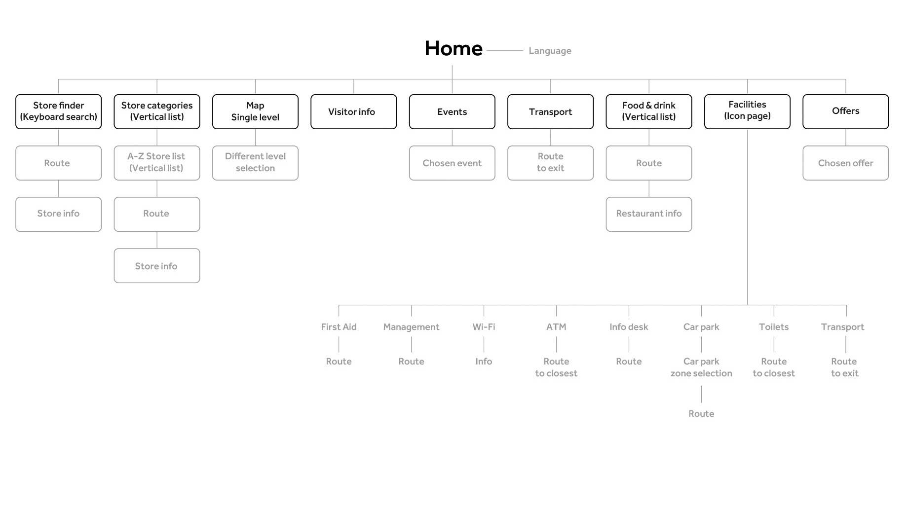
Avia Park: Store finder home
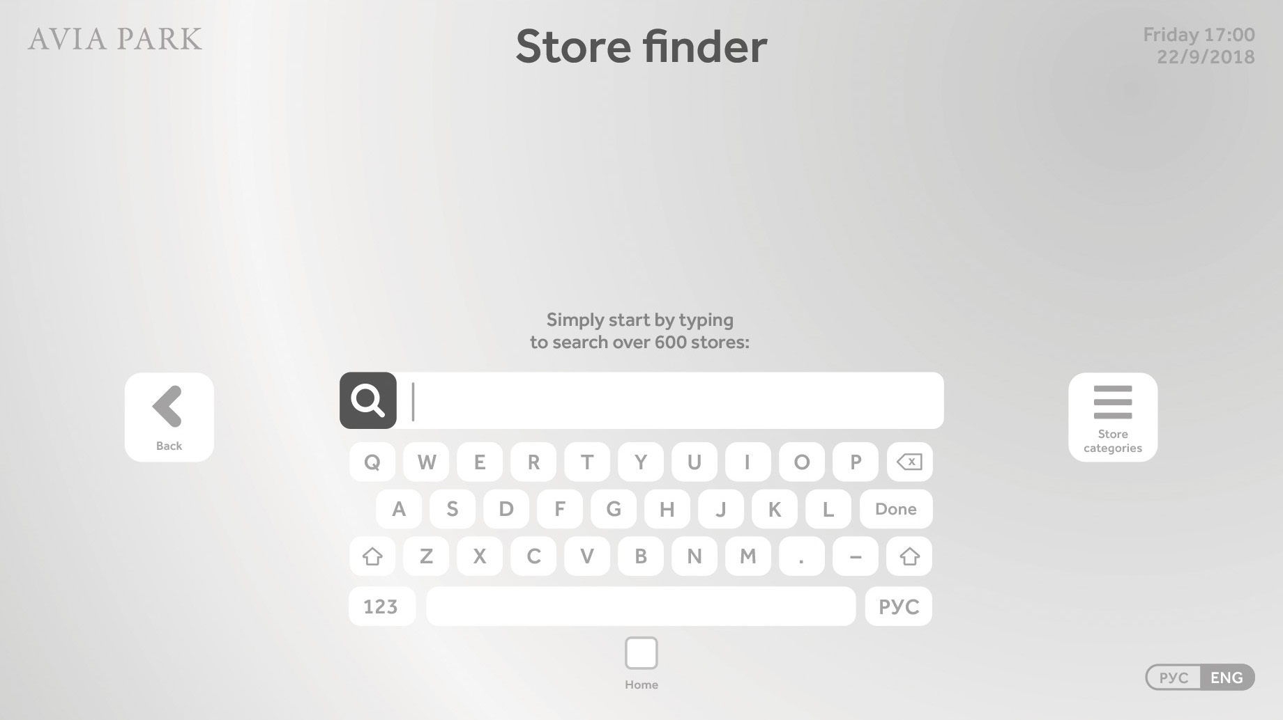
This screen allows the user to search for specific stores. Selecting a letter will bring up a list of stores beginning with that letter. Selecting ‘Store categories’ will allow the user to alternatively find stores by category rather than searching a name. Selecting the home button or selecting the top left Avia Park logo will take users to the opening home screen.
Avia Park: Store finder searching
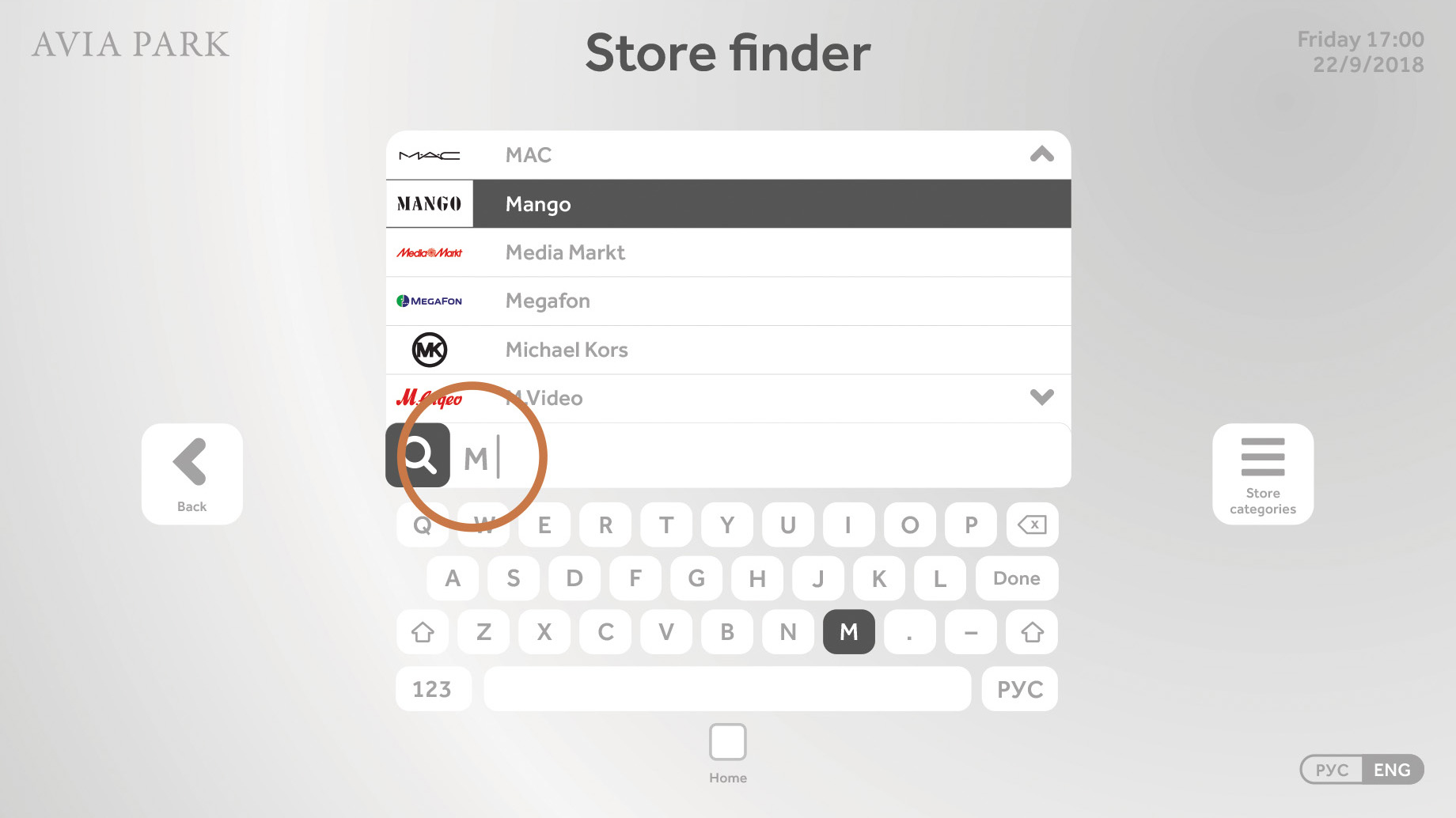
Selecting ‘Back’ will take the user one step backward in this case back to the home screen. Here the user has searched stores beginning with ‘M’ and a list of stores and their logos are displayed above.
Avia Park: Store categories
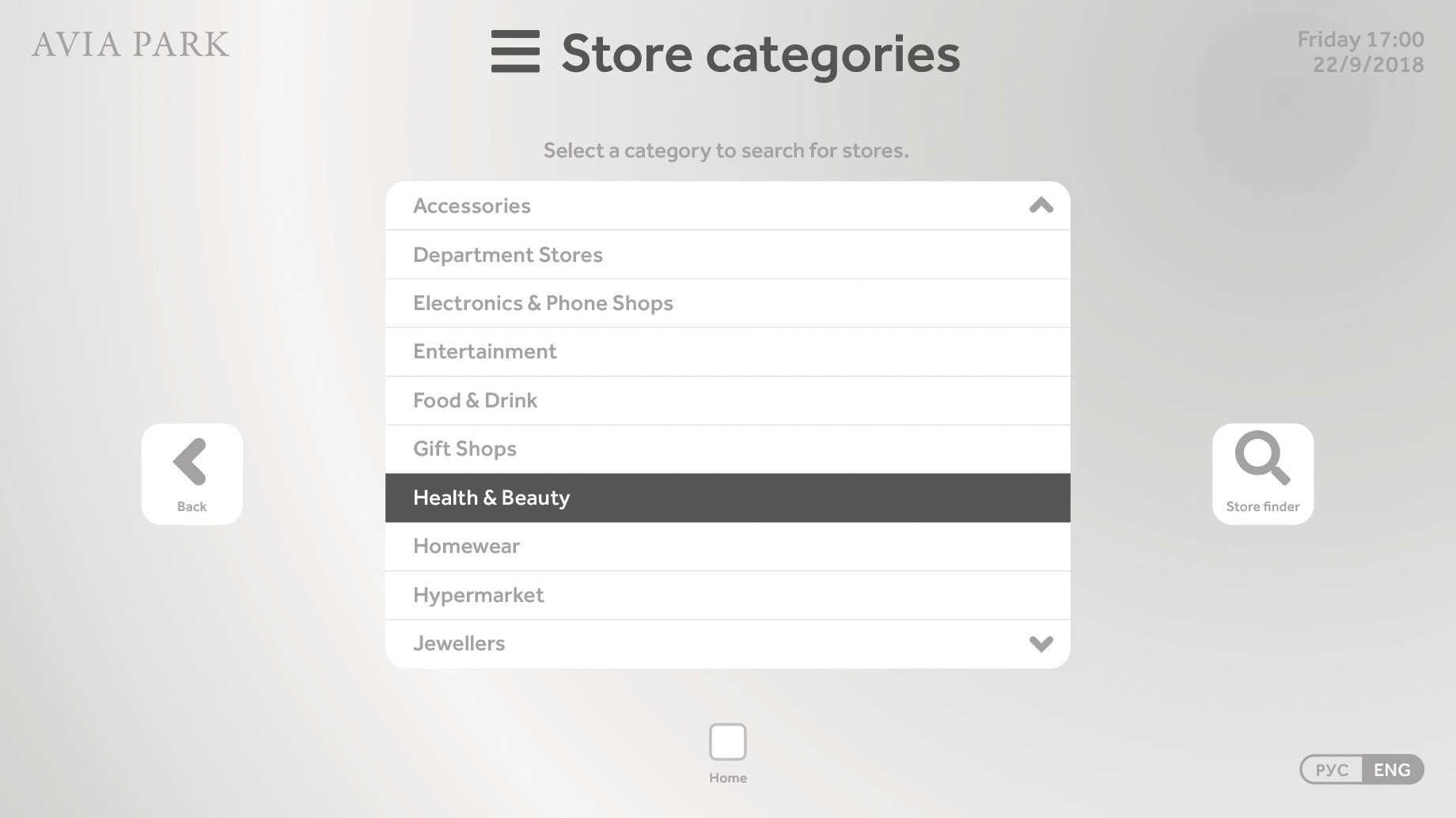
Store categories is an alphabetical scrollable menu. Selecting the right button will take you to the ‘Store finder’ where you can search for stores by name rather than category.
Avia Park: Route to store
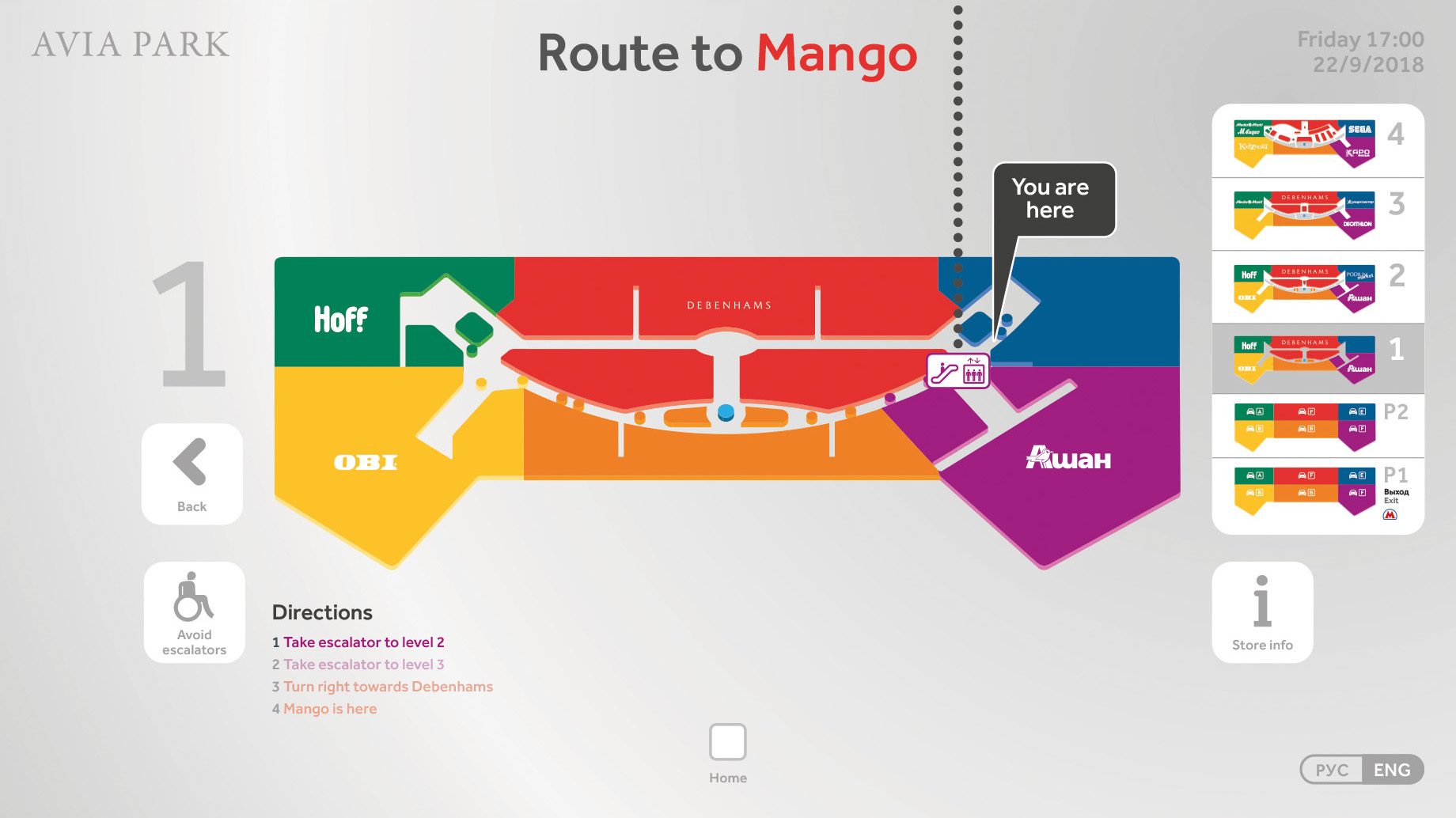
This screen displays the route from your current location to your chosen store in steps. It also gives you the ability to ‘Avoid escalators’ which alters the route for wheelchair and pushchair users. Selecting ‘Store info’ on the right will take users to their chosen stores information screen.
Avia Park: Route to store
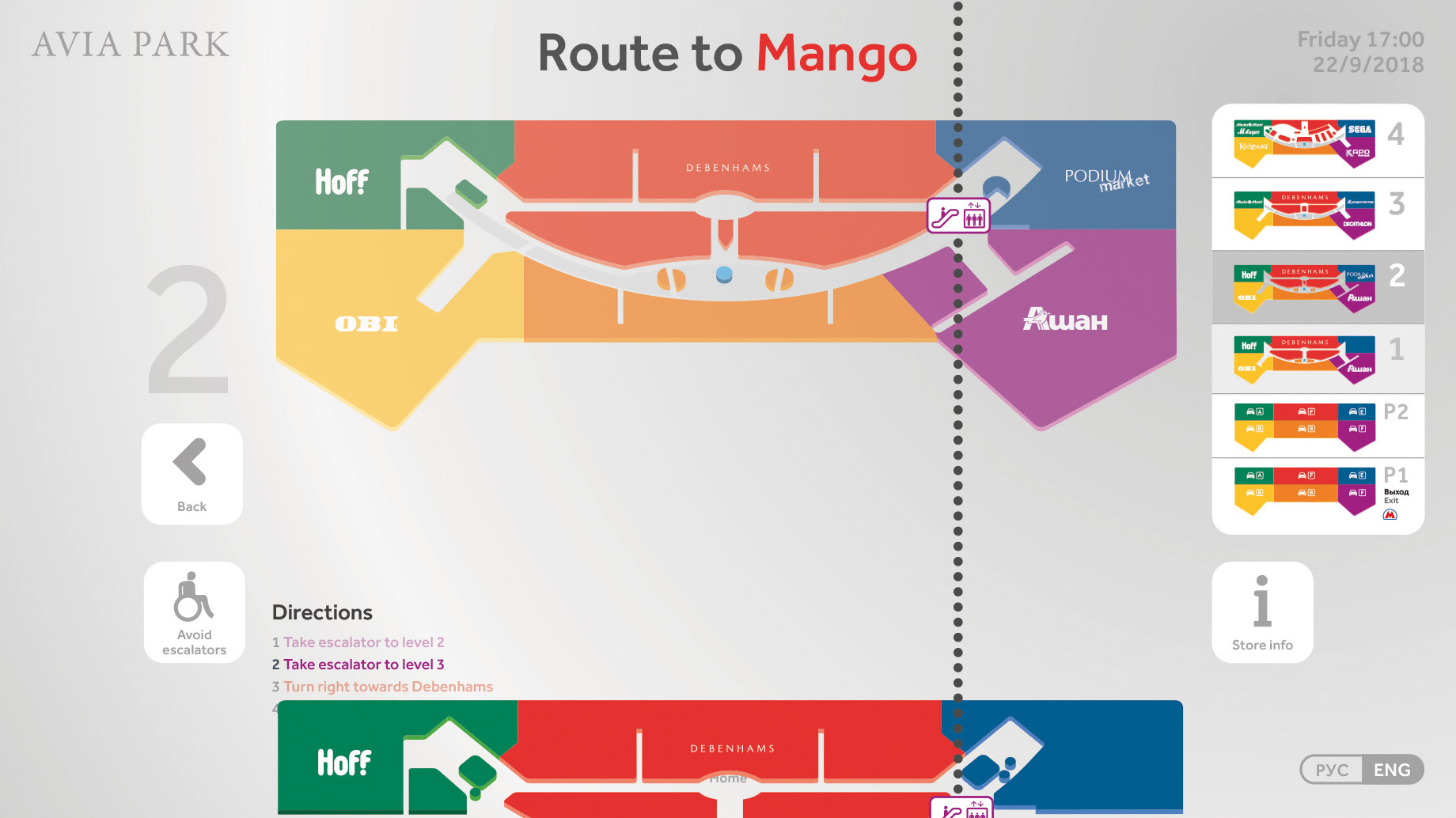
This screen displays how the users route animated, showing the journeys steps one floor at a time.
Avia Park: Offers
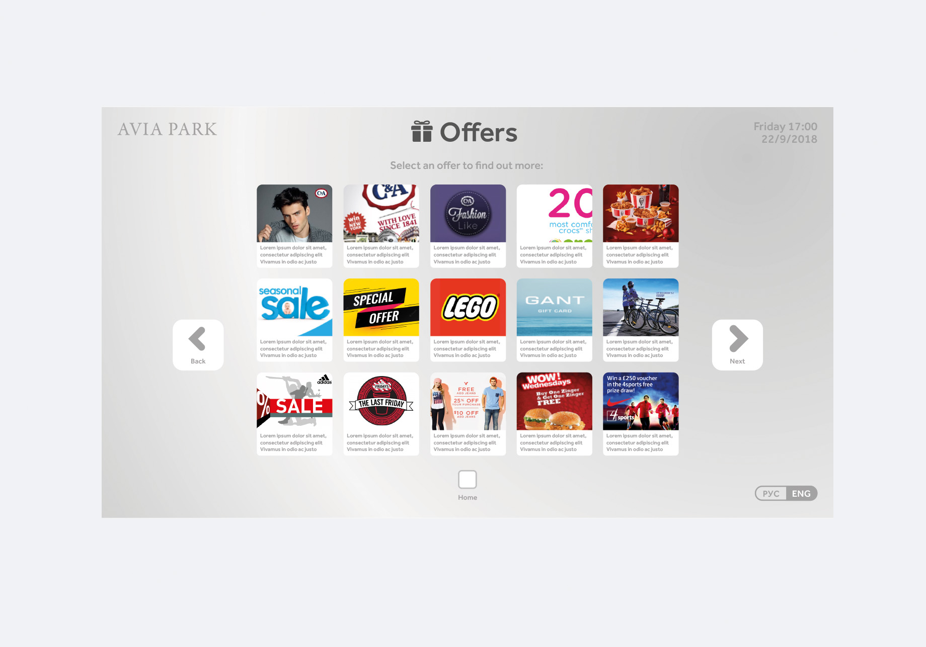
This screen displays all offers added by tenants. Selecting an offer will bring up an enlarged view with more information.
Avia Park: Offers
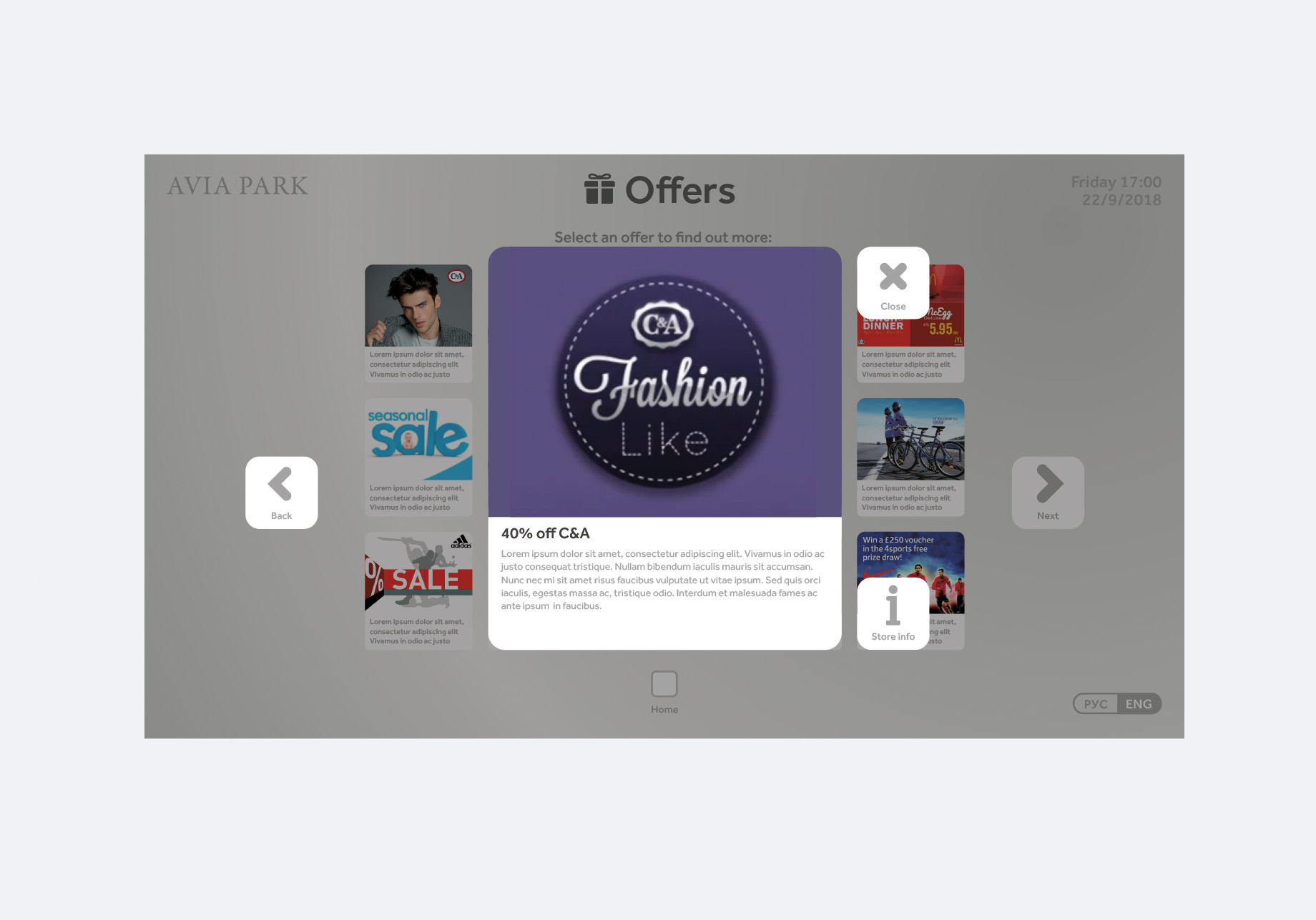
Selecting ‘Store info’ will show information relating to the store and opening times.
Avia Park: Conclusion
I gained valuable skills whilst working on this touchscreen project. I learned about the limitations of designing for a screen and the importance of legibility of text and minimum sizing. All the information must be clear and easy to understand so the user can access the information from the device as soon as possible. If it is slow and difficult to use the user will get frustrated and stop using it. It was great to work with a developer who helped ensure it not only looked great on screen but that worked well too.